
UI Design / Retail E-commerce
Currys Product Tile Redesign

Project Type: UI Design, Retail Design, Design Systems, Accessibility
Tools Used: Figma, Auto Layout, Stark
Background
This project was completed as part of a final-stage design brief for Currys, one of the UK's largest technology and electronics retailers. The challenge was to redesign an existing product tile that had become cluttered over time and make it easier for customers to move from browsing to buying.
The issue wasn't missing content—the tile already included pricing, delivery, finance options, energy savings, and trust signals. The problem was that everything competed for attention, making key information difficult to scan.
My role was to reorganise the existing content into a clearer visual hierarchy across desktop and mobile, while retaining all business-critical information.
Before opening Figma, I took time to understand the problem. My analysis showed that the tile already contained all the information customers needed.
The issue was that 22 different elements competed for attention with no clear hierarchy. Key details such as the price, delivery information, and primary call to action were difficult to find, creating unnecessary cognitive load.
Rather than removing content, I focused on reorganising it into clear visual groups, making the information easier to scan and understand while preserving all business-critical content.

Research & Planning
Next, I looked at how other retailers approached product tiles. I reviewed Argos, John Lewis, AO, and Amazon to understand what worked well and where opportunities existed.
Common patterns quickly emerged: strong product imagery, prominent pricing, clear delivery information, and a single primary call to action. These examples reinforced the importance of visual hierarchy and reducing cognitive load.
Just as importantly, they highlighted what to avoid. I deliberately excluded elements such as bundle carousels and excessive promotional labels, as they would have reintroduced the clutter I was aiming to remove.
Sketching & Design
Before moving into Figma, I explored ideas on paper. Sketching helped me quickly test layouts, experiment with content placement, and identify the most intuitive scanning pattern. This process ultimately shaped the four-zone structure that became the foundation of the redesign.
With the structure defined, I translated it into a scalable design system. I created a colour palette with clear semantic roles—purple for actions, magenta for promotions, green for positive signals, and amber for important information. Reusable components, including buttons, badges, swatches, and the energy-saving module, were supported by a consistent typography scale and spacing system. This ensured a predictable user experience while making the design easier to maintain and implement.
The Approach
The key insight from my analysis was that the challenge wasn't missing information, but poor hierarchy. Important details were present, yet they competed for attention, making the tile harder to scan and understand.
To solve this, I organised the content into four clear zones: Identity, Price & Value, Service, and Action. This structure follows a natural decision-making journey, helping users quickly understand the product, assess its value, gain confidence, and take action.
The layout was guided by Gestalt principles, using common region, proximity, and similarity to group related information and create a clearer visual flow. The goal wasn't to add more design elements, but to make existing content easier to navigate and digest.
The Anatomy
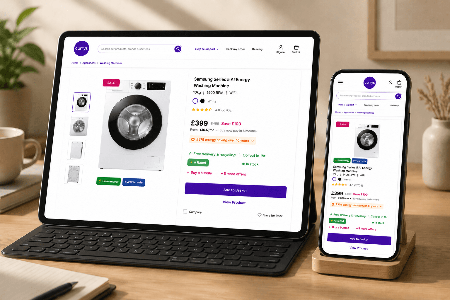
Breaking the card down: Zone one is identity, the image, title, specs, colour, and rating. Zone two is price and value, where the price is now genuinely prominent. Zone three is service, with delivery stated once, alongside energy rating and stock. And zone four is action, a single, confident Add to Basket button.

Accessibility
I tested the design properly using Stark. The redesigned card scored 94, passing all four contrast levels including the highest. The full page scored 77, comfortably passing WCAG AA. No information relies on colour alone, touch targets are a comfortable 48 pixels, and text never drops below 12.

This is the heart of the redesign. The original tile contained 22 competing elements with little visual hierarchy. By reorganising the same content into four clear zones, I improved scanability, simplified decision-making, and increased accessibility. The result wasn't less information—it was better organisation.
Business Problem & Solution
My solution kept every piece of content the business needed, but reorganised it into four clear zones that follow how customers naturally scan a product. Nothing was deleted, the energy calculator, the bundle offer, the finance option, and the trust signals are all still there. They're just given the right visual weight in the right place.
Built for Scale
Everything was built using Auto Layout, so the structure stays consistent even as content changes, and each zone works as a reusable component across both desktop and mobile.
Measurable Improvements
22 scattered elements became 4 grouped zones. The price moved from roughly 480 pixels down the card to the top third. And contrast improved from failing to a Stark score of 94, passing every accessibility level tested.

I built everything as a system, so the design stays consistent and scales easily as the product grows.
Short Summary
Nine colours, each with a clearly defined role. Purple for actions, magenta for savings and promotions, green for positive signals like delivery and stock, and amber for moments that need attention. Every colour carries meaning, so customers learn the system quickly without thinking about it. For typography,
I used a clear, consistent type scale across both breakpoints. Titles sit at 15px bold for quick scanning, prices at 25px bold to stand out immediately, body text at 14px regular for comfortable reading, and micro text at 12px for secondary details like delivery and stock status.
Nothing drops below 12px, keeping every line legible and accessible. Alongside the colours and type, I built a library of reusable components, buttons, badges, swatches, and the energy box, all sitting on a clean 8px spacing grid. This consistency keeps the design predictable for customers and straightforward for developers to implement.

22 scattered elements became 4 grouped zones.
Improved User Experience
The price moved from buried halfway down the card to the top third.
Simplified Application Process
Contrast improved from failing to a Stark score of 94, passing every accessibility level tested.
Interactive Prototype
And every piece of content the business needed was kept, just organised with purpose.
Final Thoughts
I didn't make this tile better by removing content. I made it better by giving it structure.
My Goal
This project reminded me that clarity comes from hierarchy, not subtraction. With more time, I'd want to validate the new layout with real user testing, particularly around price position and the energy calculator interaction, to see how the design performs with real customers, not just on screen. But the goal throughout stayed the same: help customers move from browsing to buying, with confidence.
Thoughts
Next steps would include moderated usability testing to validate the affordability flow.
Want to see how it's built?
The complete Figma file, with all components, states, and design system, is available here: