
Sainsbury’s Self-Checkout Redesign
UX/UI Case Study | Retail Kiosk Interface | London, UK
Sainsbury’s is one of the largest supermarket chains in the UK. Their self-checkout kiosks are widely used but often criticised for being slow or confusing, particularly for older customers or those unfamiliar with technology.
Timeline
From explorations to final designs in 2 weeks while working with multiple projects at the same time
Background
Sainsbury’s is one of the UK’s most established supermarket chains, founded in 1869, and currently the second largest grocery retailer in the country. In response to the fast-paced lifestyle of London shoppers, Sainsbury’s is exploring the development of a new self-checkout interface that removes the need for manual fruit and vegetable weighing at kiosks, streamlining the checkout process and saving valuable time for customers.
I began by identifying business challenges and kiosk hardware constraints (touchscreen, barcode scanner, scale, card terminal). I also reviewed user feedback from online forums and usability studies of similar systems.
Research & Planning
Used a Lean UX Canvas to align:
Business problem: Inefficient checkout process, low customer satisfaction
Target users: Busy shoppers, elderly users, tourists
Design & Prototyping
Solutions: Clearer steps, larger buttons, real-time feedback, optional assistance
Business outcome: Faster checkout, fewer errors, improved perception of service
Implementation
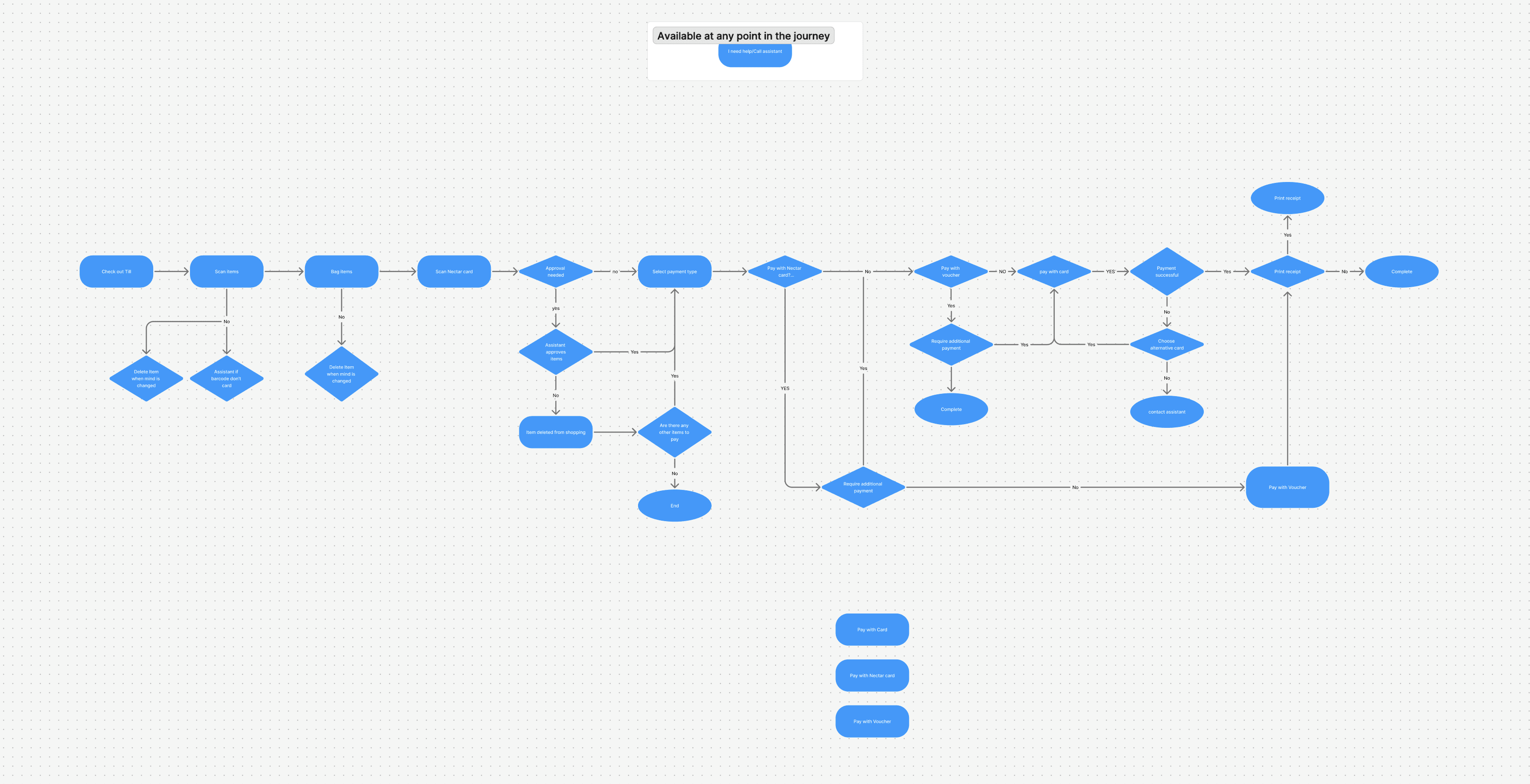
Audited existing self-checkout screens. Highlighted pain points like unclear error states, too-small tap targets, and too much text.
Testing & Optimization
A/B Testing (UsabilityHub): Compared original vs. redesigned CTA positioning and screen flow. Users preferred the new design by 72%.
User Feedback: Shared prototype with peers and users aged 40+ to identify friction points.
Tools Used
Figma • FigJam • UsabilityHub • Google Fonts • 12-Column Grid
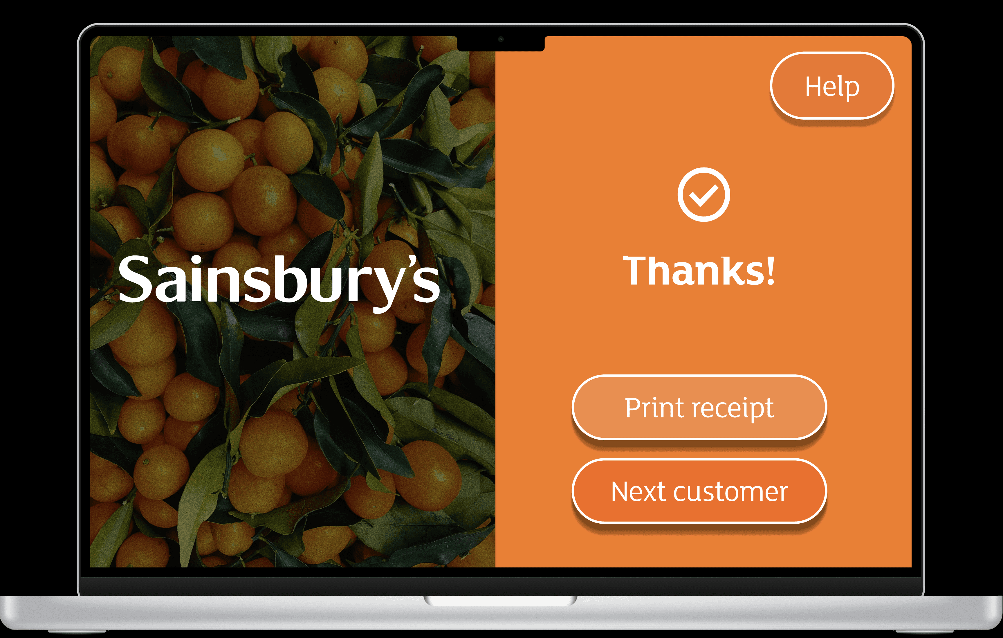
The redesigned self-checkout interface focuses on clarity, speed, and accessibility, reducing cognitive load while guiding users through a simplified, step-by-step flow.
Simplified, Guided Checkout Flow
I restructured the experience into clear, sequential steps:
Scan → Review → Pay → Confirm
Clear Visual Hierarchy
To improve usability for elderly and visually impaired users:
Increased button sizes to meet accessibility standards
Reduced on-screen text and replaced it with clearer microcopy
Used high-contrast colour combinations for better readability
Introduced stronger feedback states (e.g. item scanned, payment approved, error detected)
Business Impact
By focusing on clarity, feedback, and accessibility, the redesigned interface transforms the self-checkout experience from frustrating to intuitive, supporting both operational efficiency and customer satisfaction.

Improved clarity and task completion speed in user tests
More intuitive layout with fewer steps
Consistent brand experience and accessible UI